
Kizuna Brand Identity & Launch
Brief
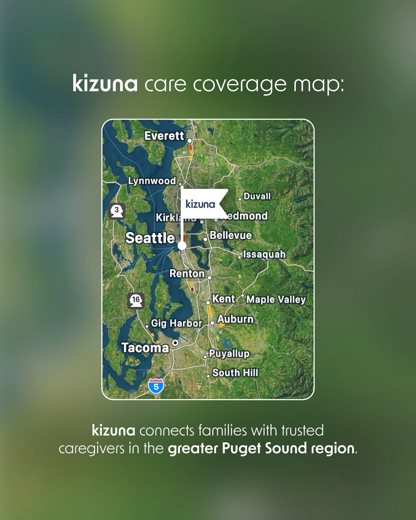
WHO - Kizuna is a care collective and new model for senior home-care, built around independent caregivers, not agencies. It’s a white-glove service experience personalized to YOUR needs, not the other way around.
ASK - Develop a cohesive brand identity and style guide that encapsulates the modern approach to home-care. Launch the brand on social media and effectively translate all aspects of brand identity.
PRIMARY AUDIENCE - Adult child of an aging parent. Our audience persona “Melissa” is a 55 year old mother, wife and daughter located in an upscale Seattle, WA suburb. With a demanding career, Melissa is seeking premium, personalized in-home care for her 82 year old elderly mother. She is buying the peace of mind that comes with high-quality care.
Style Guide
LOGO, COLOR PALETTE & TYPOGRAPHY
Many of our competitors’ branding felt dated and inconsistent. Our goal was to take a streamlined, yet elevated approach reflective of the forward-thinking brands our audience already loves and resonates with. Think Google, Oura Ring, etc.
Sans-serif typefaces reflect Kizuna’s tech-forward approach, while a bold color palette with muted tones feels inviting and reliable.

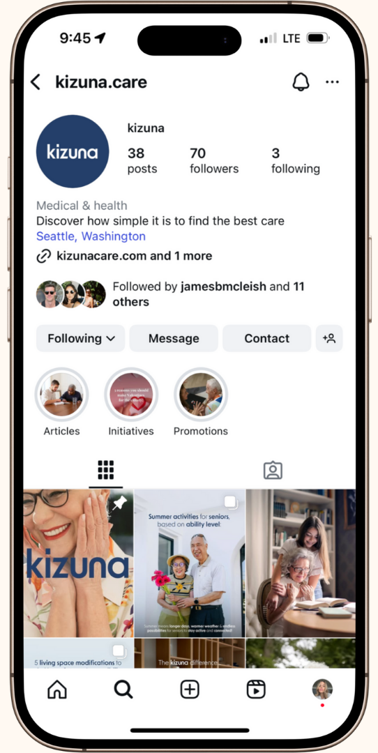
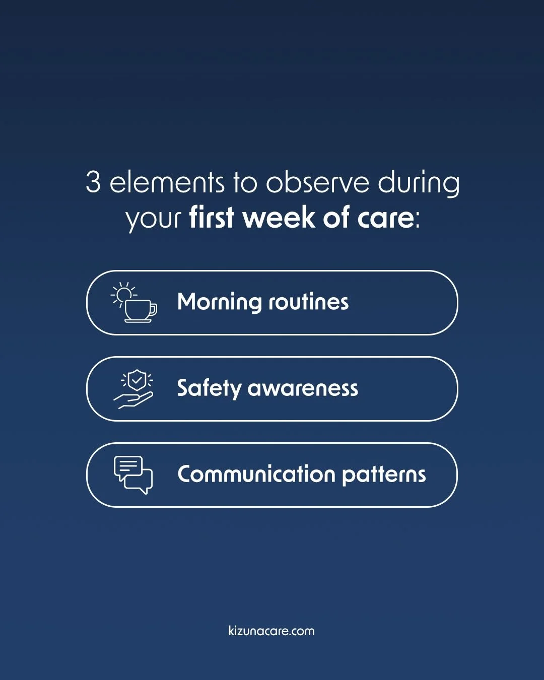
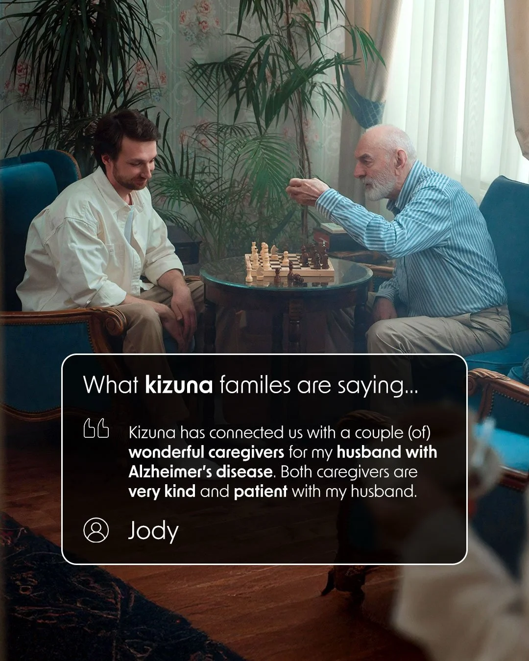
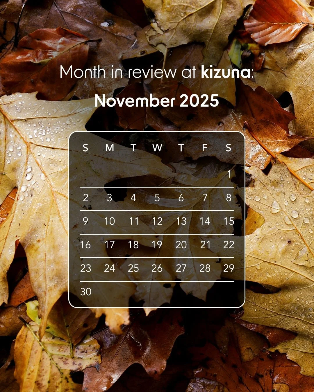
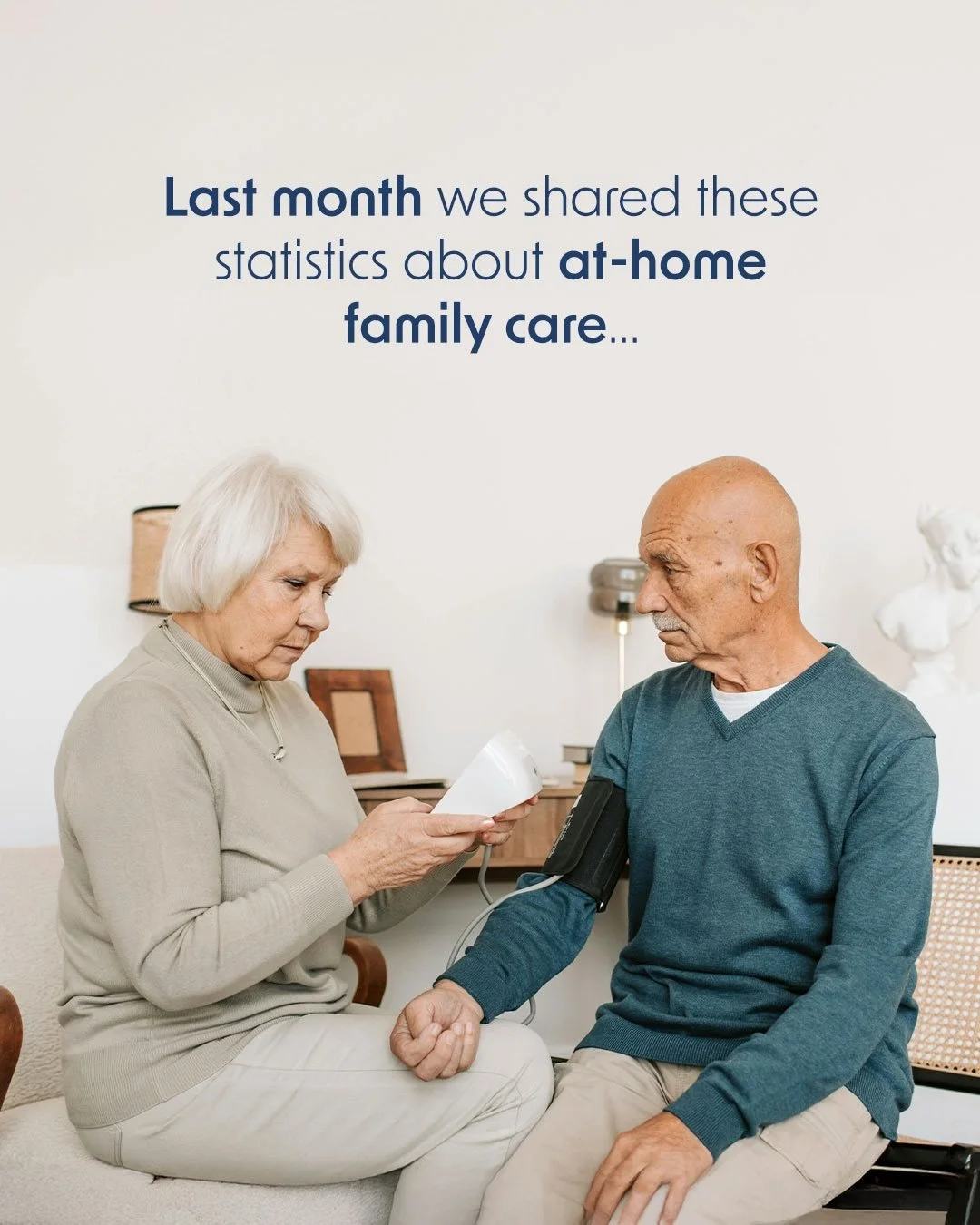
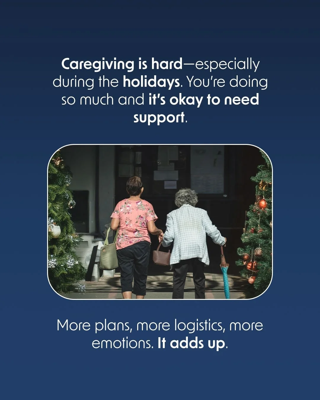
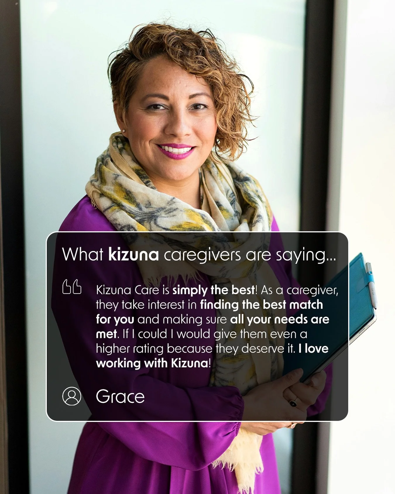
Social Media
INSTAGRAM, FACEBOOK & LINKEDIN
Social strategy, asset creation, social media development and management.


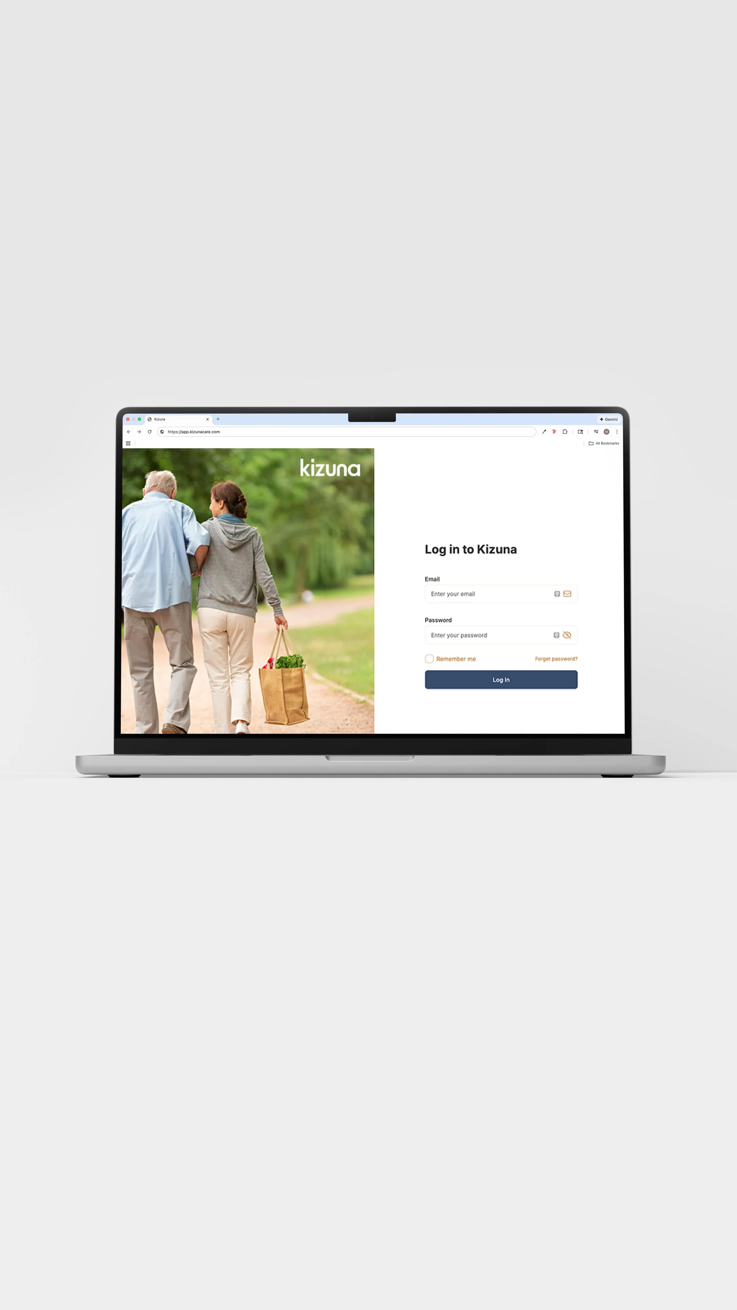
Website
DESIGN & DEVELOPMENT
Working with a web designer and developer, we incorporated the style guide into the creation of the website.